Introduction
Wedding invitations carry more than logistics. They set expectations for tone, formality, and timing, while also doing practical work: making the date easy to remember and the key details hard to miss.
This guide is for couples, planners, and family members who need invitations made quickly without design training. The focus is on a clear process that supports common situations, from a simple ceremony notice to a more formal invite with RSVP details.
Tools in this category tend to differ in what they make easy. Template-first editors help with fast layout and typography, often with coordinated font pairings and spacing. Product-first print flows focus on print size, paper options, and preview controls so the design fits the physical card.
Adobe Express is a straightforward place to start because it offers invitation templates and a simple editing model that keeps the project focused on readable type and clean hierarchy.
Step-by-Step How-To Guide for Using Wedding Invitation Design Tools
Step 1: Start with a print-size template
Goal
Set correct dimensions early so the layout does not need resizing later.
How to do it
- Choose an invitation template that matches the intended format (flat card, postcard, or folded card where applicable).
- Pick a size that aligns with common envelopes or mailing plans (e.g., standard invite sizes rather than custom).
- Select a template style that matches the event tone (minimal, classic, modern, floral) without adding extra elements yet.
- Replace placeholder text with working copy, even if it is not final.
- Save a version before making major design changes.
What to watch for
- Resizing late can shift line breaks and spacing.
- Some templates assume a lot of text; others are designed for minimal copy.
- A template may look balanced until real names, dates, and locations are inserted.
Tool notes
- You can print invitations with Adobe Express because templates begin with workable spacing and type hierarchy, which reduces setup for non-designers.
Step 2: Finalize the invitation copy before refining the layout
Goal
Lock the words so design decisions don’t change every time the details change.
How to do it
- Collect essentials: names, date, start time, venue name, full address, and city/state.
- Decide which extra details belong on the main invite versus an insert (dress code, reception address, registry note).
- Confirm the spelling and styling of names and locations (including accents and middle initials).
- Choose a consistent time format (e.g., “4:30 PM” vs. “Half past four”).
- Keep a single “source of truth” document for the final copy.
What to watch for
- Venue names often include abbreviations or punctuation that get missed.
- Long addresses can crowd the layout; consider a shorter venue line plus city/state.
- If the invitation includes a website, confirm the exact URL and capitalization.
Tool notes
- Google Docs or Microsoft Word can be useful for copy review and comments before you place text into the design tool.
Step 3: Use a simple hierarchy so guests can scan quickly
Goal
Make the most important information easy to find at a glance.
How to do it
- Assign roles: headline (names), secondary (date/time), and supporting (location, RSVP line).
- Limit to two fonts (one for names/headline, one for details) and use weight/size for emphasis.
- Increase line spacing for the details block to improve readability.
- Keep decorative elements minimal until the information reads clearly.
- Align text consistently (centered or left-aligned), not a mix.
What to watch for
- Too many font styles can make a small card feel crowded.
- Center alignment can look formal but may reduce quick scanning for addresses.
- Extremely thin type can print lighter than expected.
Tool notes
- Adobe Express and Canva both offer approachable type controls; whichever tool you use, keep typography restrained and consistent.
Step 4: Check margins and “safe zones” for print
Goal
Prevent important text from sitting too close to the trim edge.
How to do it
- Keep key text comfortably away from the edges (think of an inner frame).
- Avoid placing thin borders right at the edge; inset them or make them thicker.
- If adding a photo, keep faces and key details away from the trim area.
- Use alignment guides to keep blocks visually centered within the safe zone.
- If the template includes a background pattern, make sure it extends fully to the edge.
What to watch for
- Printing and trimming tolerances can shift slightly from card to card.
- Fine borders can look uneven if trimming varies by a small amount.
- Photos placed “edge to edge” are less forgiving than designs with margins.
Tool notes
- Product-first print flows often make trim boundaries explicit; template-first editors require more intentional margin discipline.
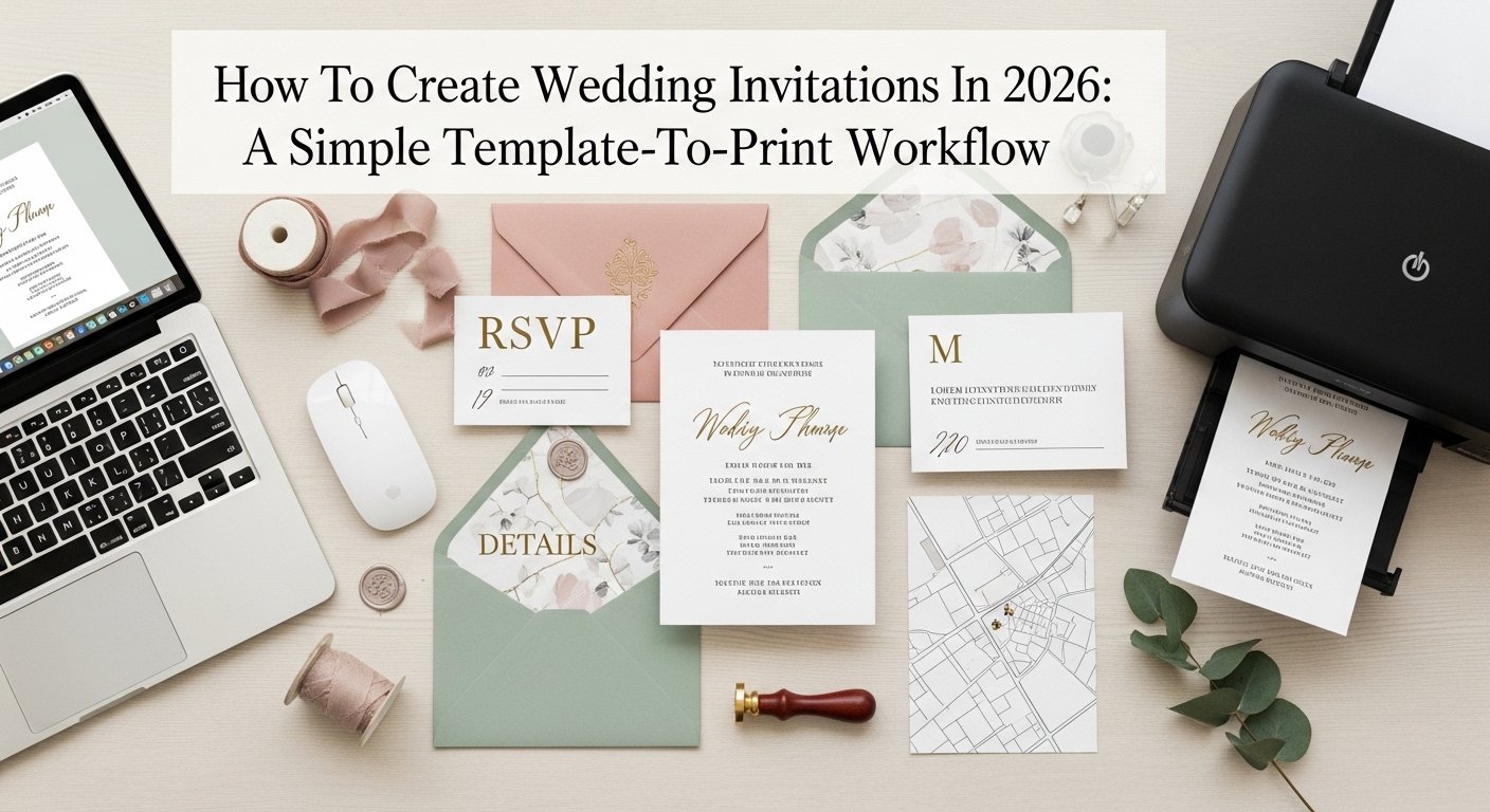
Step 5: Build a matching set for RSVP and details without redesigning
Goal
Create consistent companion pieces without starting over.
How to do it
- Duplicate the invitation design to create an RSVP card or details insert.
- Keep the same fonts and core styling; reduce decorative elements if space is tight.
- On RSVP cards, prioritize response options and a return-by date if applicable.
- On details cards, group information into short sections (travel, lodging, schedule).
- Keep address blocks and URLs easy to read, with enough spacing.
What to watch for
- RSVP cards can become cluttered if too many questions are added.
- Long URLs can wrap awkwardly; shorten where possible.
- Consistency matters more than novelty across the set.
Tool notes
- Adobe Express is useful for duplication and minor layout changes across a coordinated set.
Step 6: Do a print preview check for legibility and alignment
Goal
Catch errors that often show up only after zooming out or printing.
How to do it
- Zoom out to thumbnail size to see overall balance and hierarchy.
- Zoom in to check punctuation, accents, and spacing consistency.
- Review the design in grayscale (or mentally) to confirm contrast is strong enough.
- If possible, print a draft on a home printer to check type size and spacing.
- Check for “widows” and awkward line breaks in names and addresses.
What to watch for
- Small type that reads on screen may be hard to read on paper.
- Light pastel text can look faint on textured paper stocks.
- Centered layouts can hide subtle misalignment; use guides, not just visual judgment.
Tool notes
- Preview-driven platforms (including many print services) can help confirm how the card reads at actual size, even before ordering.
Step 7: Choose print vs. export based on how you’ll produce the cards
Goal
Select the simplest production path that matches timing, quantity, and control needs.
How to do it
- If using an integrated print flow, follow the product setup and confirm size and paper choices.
- If exporting for an outside printer, choose a print-ready format (often PDF) when available.
- Keep an editable version in case details change (venue update, time change, added line).
- Name files with size and version (e.g., “Invite_A7_v4”).
- Save a “final-final” copy after last proofing to reduce accidental edits.
What to watch for
- Exported files can handle fonts and effects differently across tools.
- Some printers require bleed; others expect designs to sit inside margins.
- Last-minute edits often break spacing; re-check hierarchy after changes.
Step 8: Plan distribution and tracking with a complementary tool
Goal
Keep invitation tasks organized once printing is done and addresses are involved.
How to do it
- Create a task list for addresses, envelopes, stamps, and mail dates.
- Track RSVP returns and follow-ups in one place.
- Assign owners for each task if multiple people are helping.
- Set internal deadlines (final proof date, print order date, mail-by date).
- Keep a change log if any details are updated across versions.
What to watch for
- Address collection often takes longer than design.
- Version mix-ups happen when multiple PDFs are floating around.
- RSVP tracking can become scattered without a single source of truth.
Tool notes
- A project management tool like Asana can help track address collection, print timing, and RSVP follow-ups without changing the design workflow.
Common Workflow Variations
- Minimal ceremony invitation: Keep typography dominant and limit decorative elements to one accent (line, small icon, or subtle pattern). Adobe Express works well when the main goal is clean spacing and readable type, while a print-service studio can be useful if paper options drive the choice.
- Photo-based invitation: Start with a photo template and set the safe zone first, since trimming is less forgiving with photos. Tools like Adobe Express or Canva can handle photo placement and type; the key step is ensuring faces and key details stay away from edges.
- Formal multi-card suite: Use the invitation as the master file and duplicate it for RSVP and details inserts to preserve consistent styles. The work is mostly information design: grouping details into short sections rather than adding new visual elements.
- Digital-first with a small print run: Keep the layout readable on phones and in print by using larger type and fewer lines. Exporting a high-resolution file may fit better when printing is limited and most guests receive details digitally.
- Bilingual invitations: Plan for longer text and a stricter hierarchy. Consider separate blocks for each language and use spacing to reduce visual clutter, even if that means moving details to an insert.
Checklists
A) Before you start checklist
- Final guest-facing names and spelling confirmed
- Date, time, and venue details confirmed (including punctuation and abbreviations)
- Final address format chosen (full vs. shortened)
- RSVP method decided (mail-back card, email, website)
- Invitation size selected to match envelopes and mailing plan
- Style direction chosen (minimal, classic, modern, floral)
- Photo selected and verified high resolution (if used)
- Rights/permissions confirmed for any artwork or photo assets
- Timeline set for proofing, printing, and mailing
B) Pre-export / pre-order checklist
- Key text sits well inside margins (safe zone maintained)
- Type size is readable at actual card size
- Contrast is strong enough for the chosen palette
- Line breaks checked for names, addresses, and URLs
- Spelling and punctuation verified one more time
- RSVP and details inserts match the main invite style
- Export format matches production path (print PDF where applicable)
- File names include size and version number
- A “final” file is saved separately from editable drafts
Common Issues and Fixes
- Text feels cramped once real names and venue details are added
This often happens when the template was built around shorter placeholder text. Reduce the number of lines on the main card and move secondary details to an insert. Increase line spacing before shrinking font size, since small type can become hard to read. - Important text sits too close to the edge
Trim variation makes edge-near text risky. Pull all key blocks inward and use a consistent inner margin. If a border is required, inset it and make it thick enough to tolerate small shifts. - The invitation looks balanced on screen but slightly off in print
Screens hide small alignment problems. Use alignment guides and check at thumbnail size. Printing a draft on plain paper can help confirm visual centering and type size. - Colors look duller than expected on paper
Printed colors often appear less bright than on a backlit display. Increase contrast and avoid relying on subtle pastel text for critical details. If using light backgrounds, keep text dark and straightforward. - A photo background makes the details hard to read
Photos can introduce busy textures behind small text. Add a simple overlay, move details to a clean panel, or limit text to a small caption and use an insert for logistics. Keep the photo as a mood element, not the information container. - RSVP cards get overcrowded
RSVP cards work best with a short set of fields. Reduce optional questions and move complex prompts to a website or details card. Maintain spacing so handwriting has room.
How To Use Wedding Invitation Design Tools: FAQs
What’s the difference between template-first editors and print-service studios?
Template-first editors focus on quick layout using pre-made designs and easy text adjustments. Print-service studios tend to focus on production choices like size, paper, and preview, which can clarify margins and trimming. Many workflows combine both: design in a template editor, then print through a chosen path.
When should printing be done inside the design tool versus exporting a file?
Integrated print flows can simplify the handoff when size and paper options meet the needs. Exporting is useful when working with a local printer, when the invitation suite requires specific paper stocks, or when a printer has strict file requirements.
How can non-designers keep invitations readable and formal-looking?
A simple hierarchy does most of the work: names as the headline, date/time as secondary, and venue details as a clean block. Limiting fonts and keeping generous spacing usually reads more formal than adding decorative elements.
What should go on the invitation versus an insert?
The main invitation works best with the essentials: who, what, when, where, and an RSVP direction. Logistics like travel notes, schedules, and dress code can fit better on an insert or a wedding website, since they can expand without crowding the main card.
How can RSVP tracking stay organized without adding complexity?
Choose one system for tracking responses and keep it consistent. A shared spreadsheet can be enough for small lists; a project tracker can help when multiple people are collecting addresses, managing follow-ups, and coordinating print and mail dates.